Unlike its VCL equivalent, the FMX TSpeedButton has no Glyph property; similarly, TButton doesn’t have the image properties added to the VCL version in D2009, and in FMX, there’s no TBitBtn class to boot. The reason for this is that in principle, there is no need for class-specific image properties:
- Add a TImage to the design surface.
- Using the structure view (top left of the IDE), reparent the image to the desired button by dragging and dropping with the mouse. (It doesn’t matter whether the button is a TButton, which takes the keyboard focus, or a TSpeedButton which doesn’t.)
- Select the image and use the object inspector to set its HitTest property to False. This prevents it from receiving mouse clicks.
This approach works fine if the button doesn’t have a caption, but when it does, an issue arises concerning alignment: the text will remain centred in the button regardless of whether the image is aligned to a certain side, so that if the image is relatively large, text will appear partly on it, and partly on the normal background:
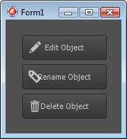
If the button images are either left-aligned (as in this example) or right-aligned, you could manually fix up the alignment by prepending or appending spaces to the button’s Text property as appropriate, however this won’t work for top- or bottom-aligned images, and moreover, causes hassles if the button’s text comes from an assigned action. So, what would make for a more principled fix?
Well, internally, a button’s text is part of its style, which like the style for any other control is composed of more primitive FMX controls. The text, then, comes from a TText control, which is placed inside a layout control of some sort that also contains a TSubImage or TRectangle that defines the button background and border.
Given that, one way to fix the text alignment issue might be to reparent our TImage to the parent of the TText at runtime. If that sounds a bit hacky, that’s because it is, and worse, the changes made to control style handling in XE3 blogged about by Eugene Kryukov (EMBT) here make it precarious to boot. Happily however, there’s a better way: when the button’s style is loaded (or reloaded), adjust the internal TText’s Padding property so that it no longer overlaps the image.
To do this generically for a number of buttons on a form, select them all in the designer (they can be a mixture of TButton and TSpeedButton controls if you want), click to the Events tab of the Object Inspector, type ButtonApplyStyleLookup next to OnApplyStyleLookup, and press Enter. This will create a shared event handler for the buttons’ OnApplyStyleLookup event. In the code editor, add the following for its implementation:
procedure TForm1.ButtonApplyStyleLookup(Sender: TObject);
var
  Button: TCustomButton;
  Control: TControl;
  TextObj: TFmxObject;
begin
  Button := (Sender as TCustomButton);
  for Control in Button.Controls do
    if Control is TImage then
    begin
      TextObj := Button.FindStyleResource('text');
      if TextObj is TText then
        case Control.Align of
          TAlignLayout.alLeft:
            TText(TextObj).Padding.Left := Control.Width;
          TAlignLayout.alTop:
            TText(TextObj).Padding.Top := Control.Height;
          TAlignLayout.alRight:
            TText(TextObj).Padding.Right := Control.Width;
          TAlignLayout.alBottom:
            TText(TextObj).Padding.Bottom := Control.Height;
        end;
      Break;
    end;
end;
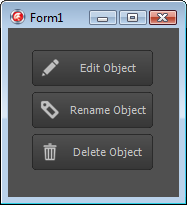
What we do here is cycle through the button’s controls looking for the TImage; when we find it, we then look for the TText style resource and adjust its Padding accordingly. Here’s the result:
PS – if having read this far you’d still prefer a button class with a dedicated Bitmap property, check out Mike Sutton’s custom TSpeedButton descendant here.

